Maps are awesome. And it turns out that making your own maps is a real joy too.
If you enjoy creating that perfect chart or graph in Excel, or look on with mild envy at others’ charting styles (I’m looking at you, The Economist!), well, map making could be for you.
As a hobby, map-making combines data-geekiness and problem solving, plus user experience and aesthetic design considerations.
Modern, open and free software and data are there waiting for you to jump in and get, er, cartographing. The only barrier to entry if you already have an internet connection and a reasonably modern computer is the learning curve required to access the data and drive the software.
This article is intended as a gentle introduction to help the new mapper get mapping. It won't go into all the details, but will hopefully guide you in the right direction to search out the information you need.
It’s the same fun of sharing data in an easily digestible manner, but with even more levers to pull / dials to tweak to get it looking just right.
And the great part of map making in 2020 is that all the data and tools are freely available to use.
What makes up a map?
The following is what I’ve learnt as a self-taught GIS-lover. I’m sure there are GIS experts out there who know tricks to speed the process up, and certainly there are better ways to implement things, but hopefully this will help newcomers on the to GIS happiness.
Before we go into detail, there are three key parts to mapping:
- Data: The data can come from anywhere, and there are a whole bunch of interoperable data standards that can be used — I mostly use OpenStreetMap,
and data, but if you know of any other interesting datasets, let me know! By the way, if you haven’t come across OpenStreetMap before, go check it out; in summary, it’s Wikipedia but for maps. Maybe you could help improve the mapping in your local area by using the StreetComplete app on your phone, or get mapping in detail using JOSM. - User interface: To generate the map itself, QGIS is brilliant. It’s a free and open source map generating system. It can process and create all manner of astonishing things. Because of this complexity, it can take a bit of getting used to, as the interface isn’t the most intuitive for the first-time user. But don’t be put off; there’s a logic behind it!
- Styling: The data tells you what is where, and the user interface lets you compose that data. The missing piece is how to make that data look like a map. It turns out that maps are filled with intricate complexity when it comes to colours, line thickness, occlusion, text positioning, etc. A style pack takes the raw geographical data and makes it look like a map.
A worked example
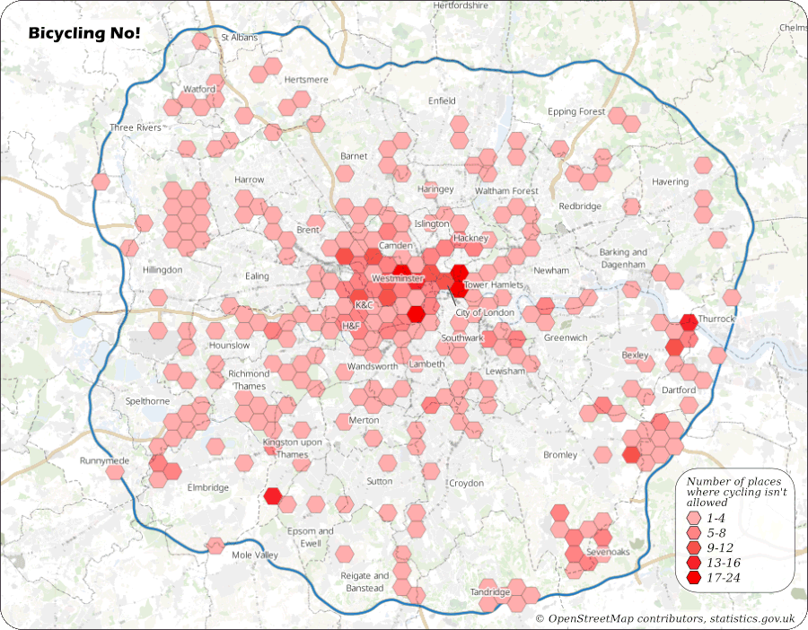
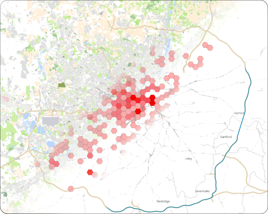
Here’s a map that uses OpenStreetMap data to show the number of places where cycling isn’t permitted in London. I Call it “Bicycling No!”, which is a play on the underlying data used to create it. It’s a good example for us to dissect to help understand how modern digital maps are made.
The aim for this map is to highlight the varying distribution of places where cycling is forbidden in London. I chose this as it was a fairly easy dataset to extract from OpenStreetMap. It’s easy to read too much into this map as it doesn’t factor population density into account, but it’s a nice dataset to play with.
So let’s get dissecting. Once we know what makes up this map, we can go through the steps to recreate it.
The many-layered map
Maps are made up of layers, just like in a graphics editor. Well, unlike graphics editors, there are extra rules that allow parts of a layer to jump on top of others. More on that later… but for the most part, it’s just layer stacked on top of layer. Each layer can be set with different opacities and opacity types.
So what’s in this specific map? Well, it’s made up of five layers:
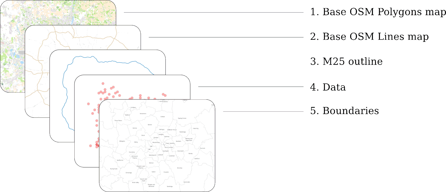
The OSM map background layers
The two layers at the back (1 and 2) combine to create the underlying map and come from OpenStreetMap. The data from OpenStreetMap is actually made up of four individual datasets:
- OSM Polygons (Forests, buildings, river extents, residential areas…)
- OSM Lines (Roads, rivers, fences…)
- OSM Roads (Road names)
- OSM Points (Town names, churches, fire stations, post offices, bus stops…)
As the focus of this map is the data hexagons, not the underlying background map, I didn’t use the OSM Roads and OSM Points datasets, as they just added cognitive noise to the background.
There are two ways to get OpenStreetMap data into QGIS:
-
The easy (but not very flexible way) is to use OpenStreetMap’s XYZ raster tiles. This will give you the equivalent of the OpenStreetMap slippy-map. The upside is it’s easy to set up and very quick to render. The downside is that you have no control over how the map looks. The tile you get is the tile you see.
When I first started mapping, I found it a great way to try things out and learn QGIS without setting up anything else. -
If you want control over how your maps are rendered, you will need to download the OpenStreetMap data and render it locally.
Downloading and ingesting OSM data
If you want more control over how your OpenStreetMap map looks, you need to download the data yourself into a Postgres database and give QGIS access to it.
Here’s how it works:

-
Prepare the database:
- Install the latest version of Postgres.
-
Connect into it and create a new database.
CREATE DATABASE OpenStreetMapDB; -
Log into the new database and install the PostGIS extensions into it. You may need to download PostGIS.
\connect OpenStreetMapDB; CREATE EXTENSION postgis; -
Create a normal Postgres user that can access this database with read/write permissions.
  CREATE USER {username} with encrypted password '{password}';
  GRANT ALL privileges on database OpenStreetMapDB to {username};
-
Download and ingest the OpenStreetMap data:
- Download the osm2pgsql tool. It runs on any modern operating system.
- Use Geofabrik’s download server to download the latest “England” .pbf file.
- Run osm2pgsql to ingest it into your Postgres database.
This might take some time. If you want to lower the amount you download or need to keep your database memory footprint low, you could download just the “London” and “South East” .pbf files and ingest both of them.osm2pgsql -U {username} -W -d OpenStreetMapDB -H 127.0.0.1 --number-processes 24 -C 20480 england.pbf
-
Set up QGIS:
- Download, install and run QGIS.
If you haven't used QGIS before, it's well worth watching some YouTube tutorials on how to drive it. - Create a new project.
- Add a new PostGIS connection into your database. Follow the instructions to set up your login details. Once done, you can drag the OSM data into new layers.
- Download, install and run QGIS.
This is what you’ll end up with if you drag the planet_osm_polygon dataset into a layer:
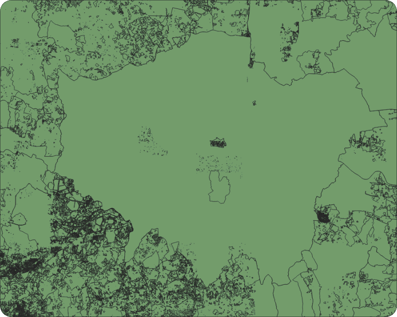
Well, it’s London-shaped, but is missing the styling.
Clone GitHub user yannos’s “Beautiful OSM in QGIS” styling repository: https://github.com/yannos/Beautiful_OSM_in_QGIS and follow the instructions to apply this styling to your planet_osm_* layers.
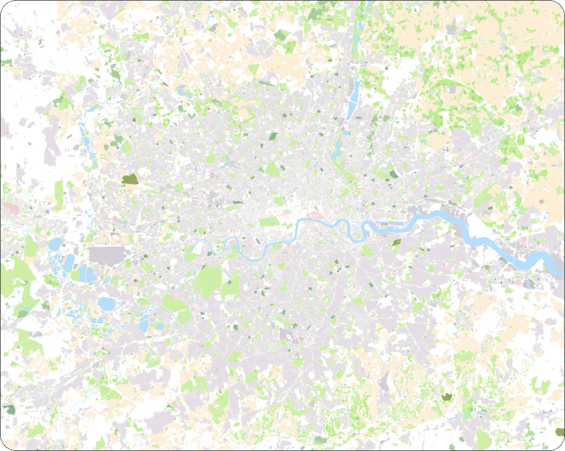
...Success!
It can take a bit of time to render the OSM layers — there’s a lot of data there! On my Intel-i5 laptop it takes about 20 seconds. On my old Intel-M laptop, it took a very long time.
By the way, it is possible to avoid Postgres entirely and use OSM data directly with shapefiles (another GIS standard file format) on your hard drive, but the rendering performance of these is terrible. Much better to get a database set up to do all the heavy lifting.
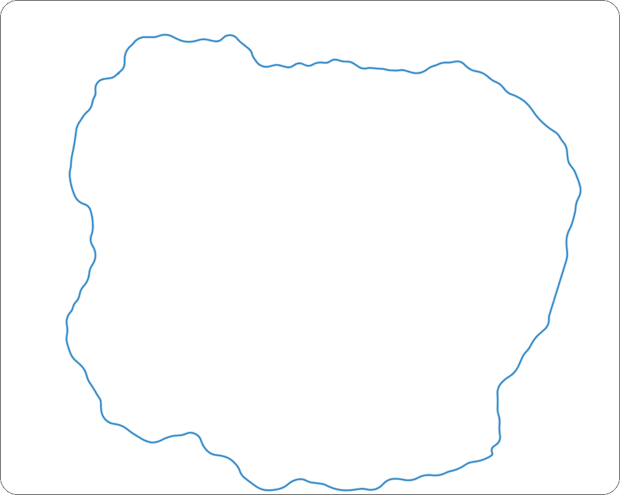
The extent of the data; the M25
Next up is the outline of the M25 motorway. For the reader of the map, this helps define the scope of the data presented. For the map maker, it’s useful too, as we use its shape to filter away all the places where cycling is forbidden outside of London (because for this map, we’re only interested in the data inside the M25). And yes, for those of you who are right in saying the inside of the M25 isn't the boundary of London, this video is for you.
To create this M25-shaped polygon, we need to download the entire M25. You can use the OpenStreetMap web map’s data layer (or the brilliant map editing tool JOSM) to find how OpenStreetMap defines the M25.
Then you can use the Overpass-Turbo API to download all OpenStreetMap objects that have this “M25 motorway” relation as a GeoJSON file.
Loading this file into QGIS, you'll likely find there are two problems with the M25 as we’ve downloaded it:
- It isn’t actually a complete ring around London (gasp!).
- It has two lines within it (the clockwise and anticlockwise carriageways) rather than just one.
So we need to do a bit of a manual tidy-up, as we want a single, filled polygon.
QGIS can do its best to create a filled polygon, but doesn’t get it right until you remove remove the second ring. Use QGIS’s Processing/Lines to Polygons function and then delete the inside (anticlockwise) lane.
This is what we’ll end up with:
All your data are belong to map
Layer 4 is the data layer. It looks like a sparsely populated grid of hexagons, but there are actually hexagons covering the whole of London, you just can’t see them all. We use the magic of QGIS’s “Graduated symbology” to set the colour of polygons with data underneath them and hide all the others.
Here’s how it’s done:
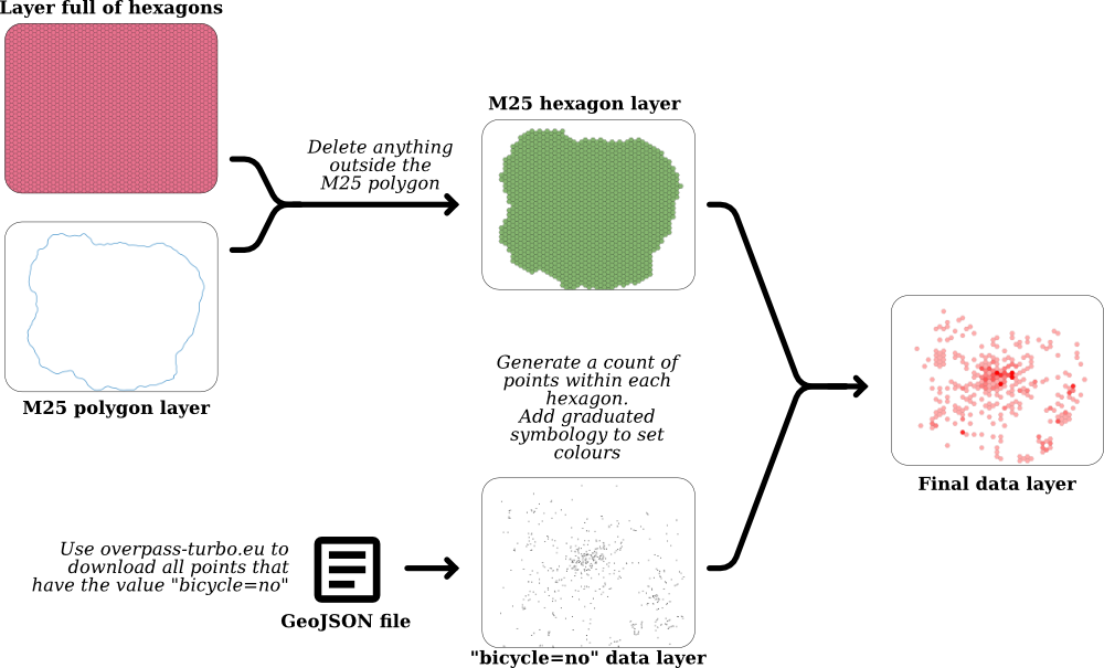
First off, we need hexagons. Lots of them. We can use the QGIS plugin MMQGIS to create a sea of hexagons covering the entire map.
Next, we need to remove all the hexagons outside the M25. We could do this by hand, however QGIS has a great set of selection tools, so we just use QGIS’s Vector Research tools to select all hexagons that are within the M25 polygon. Then we copy/paste those hexagons into a new layer and delete the original hexagon layer. There are a few hexagons that are only a tiny way inside the M25 but are mostly outside — delete these manually as you see fit.
Now that we have hexagons all over London, we need to give them data. At the moment they’re just hexagons with no idea what’s going on.
To get that data, we can filter it directly out of OpenStreetMap using the Overpass Turbo API. You could probably do the same by querying the data you have in your Postgres database, but the Overpass Turbo API makes it nice and easy.
Using overpass-turbo.eu we can request all data points for a given region that have the key/value pair of “bicycle=no” as a GeoJSON file.
To learn more about OpenStreetMap features, have a dive into the OpenStreetMap Wiki's Map Features page.
In summary, OpenStreetMap has the following:
- Nodes (for point data).
- Lines (two or more nodes joined together).
- Polygons (an enclosed line).
- Relations (links between Nodes, Lines and Polygons that describe bigger things like boundaries, long stretches of road, etc.).
Nodes, Lines, Polygons and Relations can all have a set of key-value metadata attached to them that describe to the map renderer what they define in the real world.
Once the “bicycle=no” GeoJSON file has downloaded, drag and drop it into QGIS. It will appear as a new layer.
Go back and select your London Hexagons layer and use QGIS’s Vector Analysis tool to count all the data points within each polygon. Now each one of your hexagons will know how many “bicycle=no” points are within it. You can see this by opening up the Attribute Table:
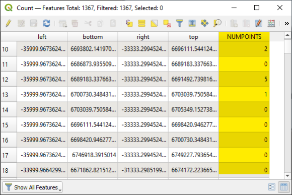
Each hexagon has a NUMPOINTS value that says how many “bicycle=no” data points are within it.
Set the Symbology of your hexagon layer to represent these values (right click on the layer, choose Properties, then Symbology and choose "Graduated".). Set the colours as you see fit, and set the opacity of any hexagon with “NUMPOINTS=0” to zero to hide them away.
Success! You have your data layer.
The authorities
The last layer is a bit easer to create. Head over to geoportal.statistics.gov.uk and download the latest local authority boundaries data as a GeoJSON file. Import this into QGIS, adjust the transparency and line types. Add legends based on the “LAD19NM” field and tweak how the text looks until you’re happy. You may need to manually nudge some of the legends as it gets quite snug with boroughs the closer you get to the centre of town!
And that's (almost) a wrap
The final step is to tweak how the layers are rendered. The two changes that I made to the defaults were as follows:
- It turns out that by default, OSM styles river names so that they push in front of all map layers. These look peculiar floating in front of the data hexagons. As we don’t need river names, we can simply deactivate them.
- The OSM Polygons layer was distractingly vivid. I had to de-saturate it quite a bit to stop it jumping out for attention.
Once you have your map looking as you wish, you can export it out as a PDF or SVG file. QGIS doesn’t shine at this layout exporting, so you may need to do add in titles, legends and attributions using the vector editor of your choice.
I use Affinity Designer as it’s cheap (about £50) compared to other commercial graphics software, filled with functionality but most important of all, great fun to use. I’m sure you can get the equivalent results with the Gimp and/or Inkscape.
I hope that you have found this interesting. There’s a lot of detail covered, but also a whole layer of additional detail missed out, just to make this article a reasonable-length. You can find out more by watching YouTube tutorials on QGIS. That, combined with a healthy amount of Googling should put you in good stead.
Tools, chains...
To end, here’s the full tool chain that I use to create maps:
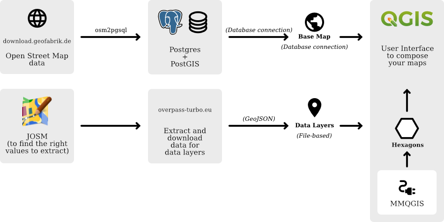
Hopefully this article has helped guide you to setting up your first QGIS/OSM map. Happy mapping!